Color was the name of the game at the latest High Point furniture market. For the last few years we have noticed that as the economy comes back, color does so as well. It is said that as colors in fashion and design go, so goes the economy—brighter colors are good predictors of an increasing economy and optimism. Neutrals and darker colors have been a pretty good indicator of a more somber mood and more bearish economy. That does not mean we have to design our homes based on these observations, only that colors in design and fashion do appear to be a predictor of what is coming.
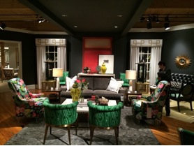
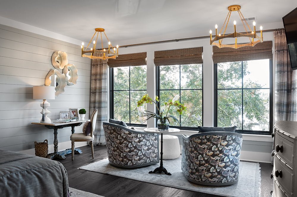
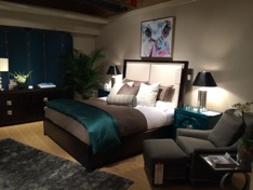
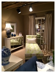
Greens and blues are still the rule. Both the greens and the blues are becoming clearer tones—less gray and beige in them. The greens are more of a malachite tone–green with a bit of blue, but not as blue as turquoise. The blues are a peacock blue—bright and cheerful.
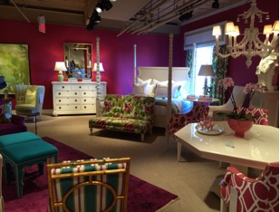
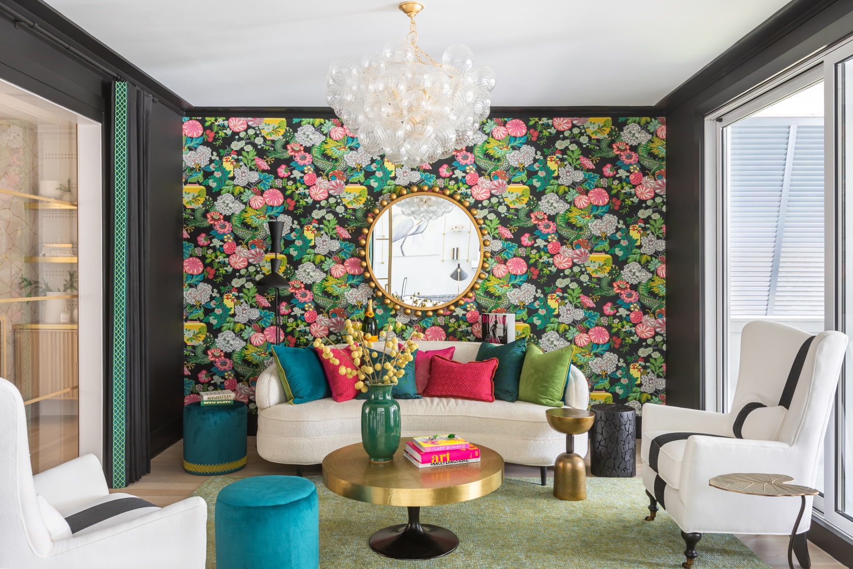
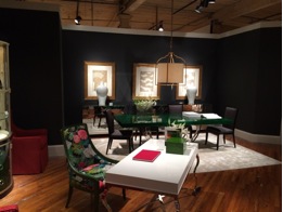
Pinks and corals were being shown a lot as well. The colors were intense and rich. They were used boldly and in more than small doses. In some instances they were used in large doses.
We saw the use of charcoal, rich deep grays, as the new black. The new charcoal color is easier on the eye than black, and oddly enough, is warm and inviting. Some of the charcoals had a tinge of purple to them, subtle, but definitely there.
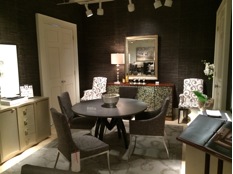
Stylistically, there is a preponderance of transitional styling. For years we referred to a particular look as contemporary. I noticed at this market that the line of contemporary and transitional are blurring. Showrooms that are true design showrooms, with large product offerings of all styles, almost all leaned this direction with very little traditional styling being shown. Of course, we still have traditional showrooms; that will always be such. But interestingly, those traditional showrooms used more contemporary art than traditional art. So, they are moving that way too. We discussed that at some point in design it is no longer called contemporary but just “the current style.” I mean, there was a time when Chippendale would have been the new thing—did they consider that their “contemporary” of the time? Maybe.
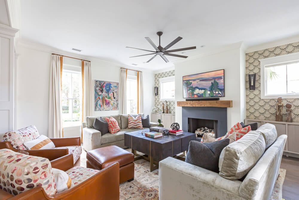
Market was a shot in the arm, as it always is–New ideas, new colors, new directions. But all in all, we found that a mix of many styles and designs create the most interesting spaces. We find that mixing contemporary pieces in traditional rooms and antique pieces in contemporary rooms make for the most comfortable spaces. After all, spaces need to feel acquired, not decorated.
Off to Europe in a couple of weeks to get a perspective on the European markets and to buy a container of accent pieces and antiques for our stores. Let us know if you have any items you want us to look for.
– Lance