While in the past decade, we saw an overabundance of neutrals such as cool grays and “greige,” the use of bright colors in interior design is on the rise. People are finally seeing the light! That said, we often have clients come in and express a fear of committing to any one color or color scheme. In that case, cue the BLUE!!!
Blue is arguably the most timeless and classic color you will find. In fact, blue reads as a neutral in many different settings, and is quickly becoming a trendy yet safe way to add color to interior spaces. The beauty of blue is that it mixes perfectly with both bold colors and neutral hues.
Blue and Neutrals
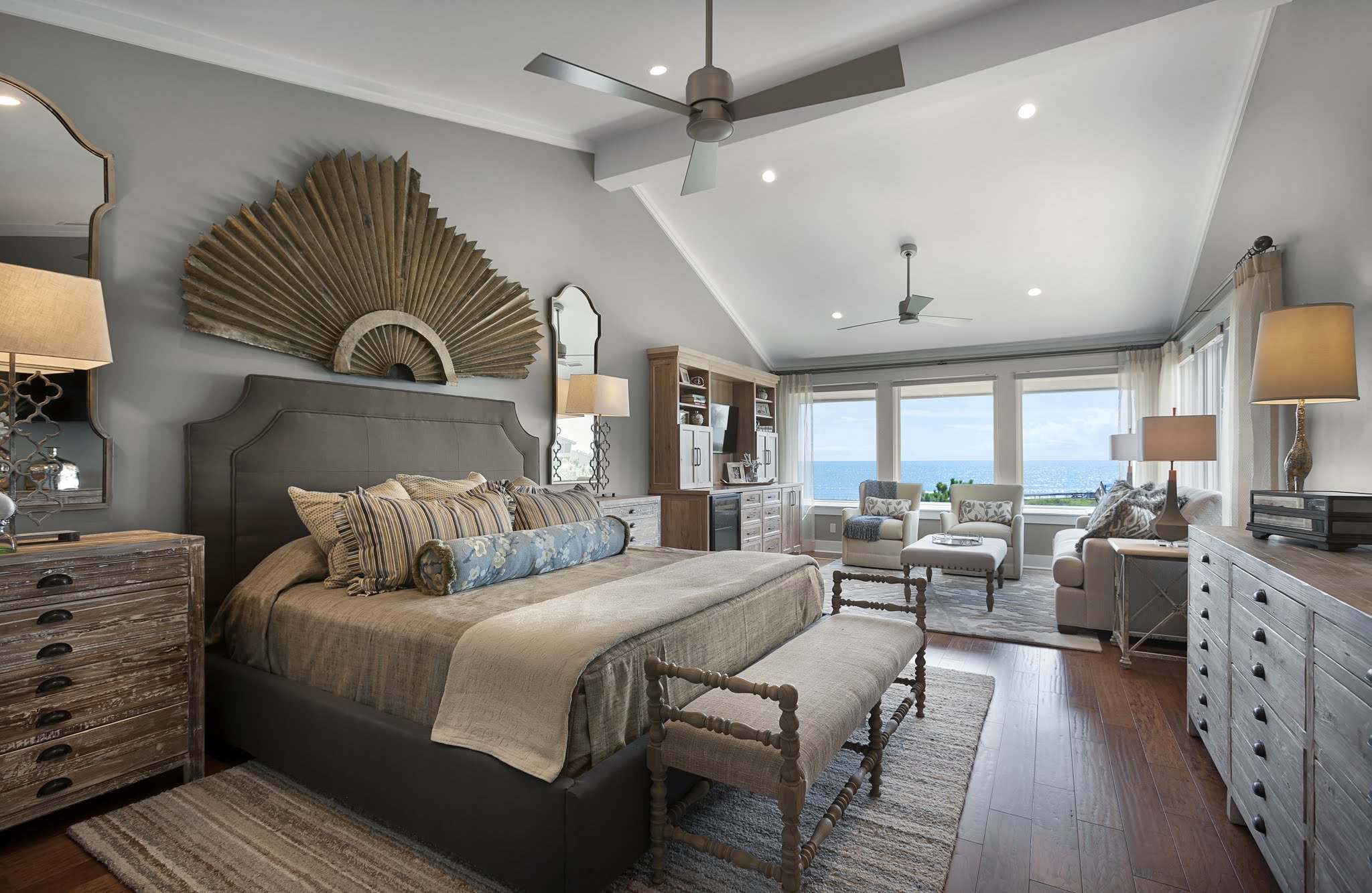
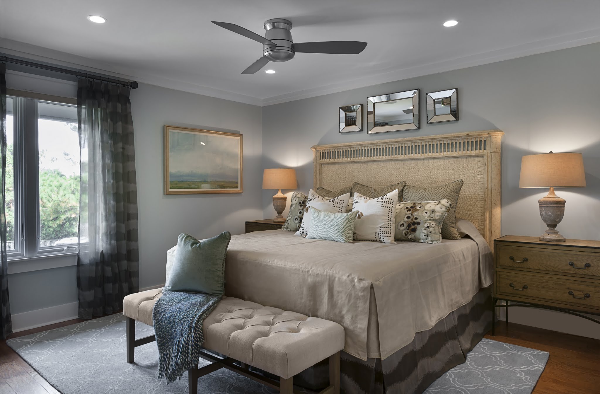
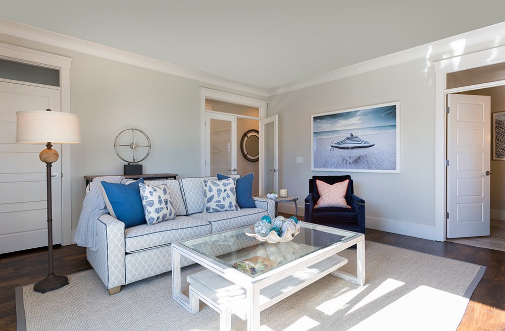
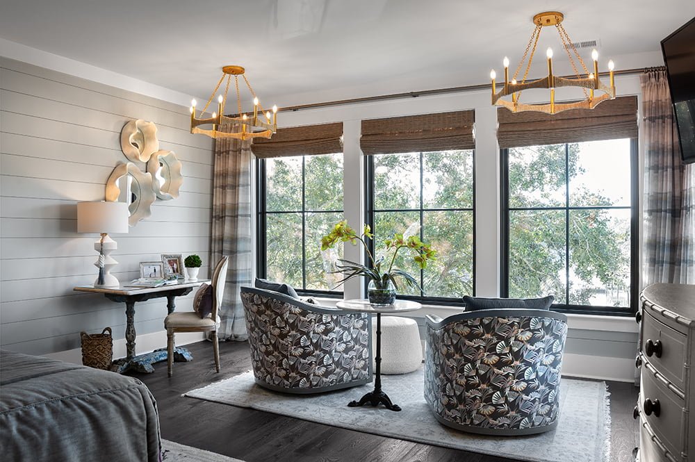
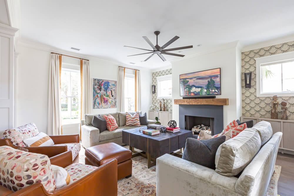
For someone afraid of too much color or seeking a calm and breezy atmosphere, a hint of blue is the perfect solution. Introducing blue into a primarily neutral palette is a subtle way of brightening a space without interfering with the serene ambiance.
Blue and Bolder Colors
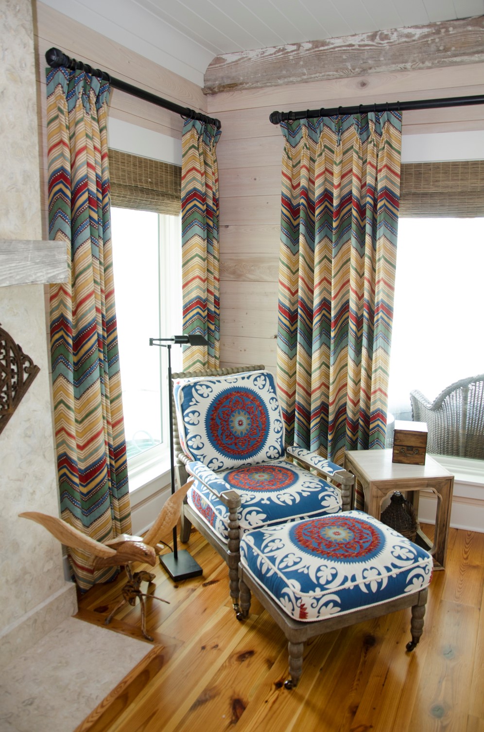
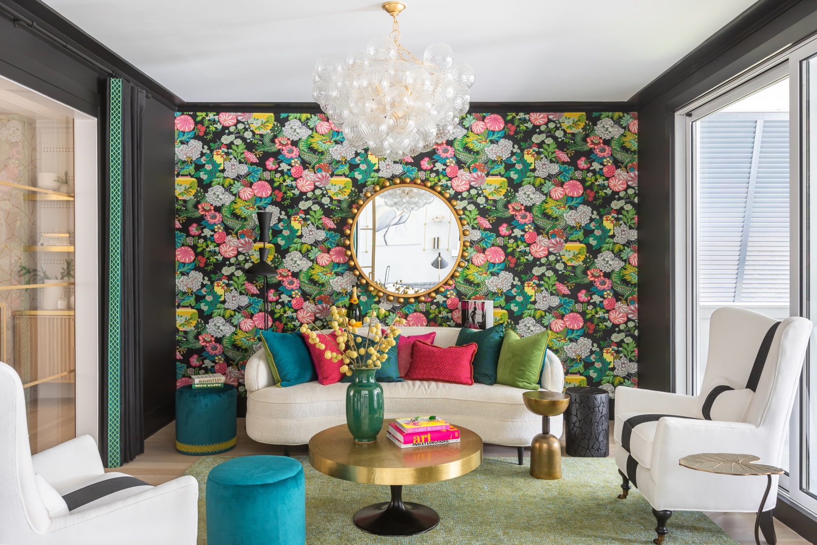
Perhaps you aren’t afraid of bright colors but you want to use something timeless and classic. In that case, blue is the color for you! Introducing blue into a color palette can bridge the gap between the neutral and bolder colors.
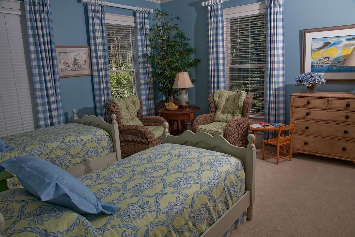
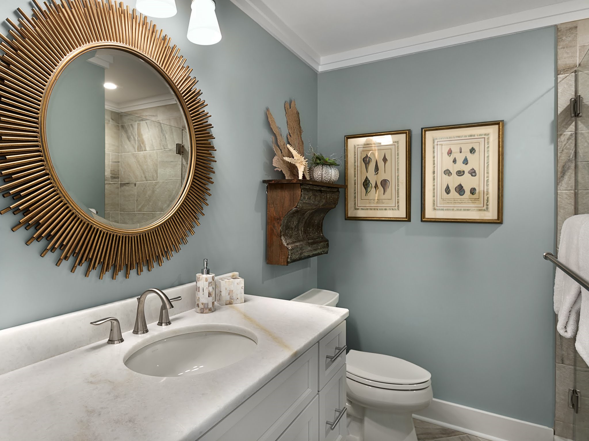
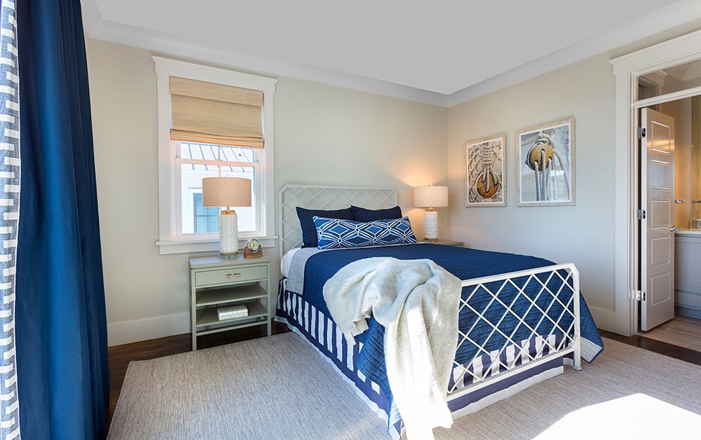
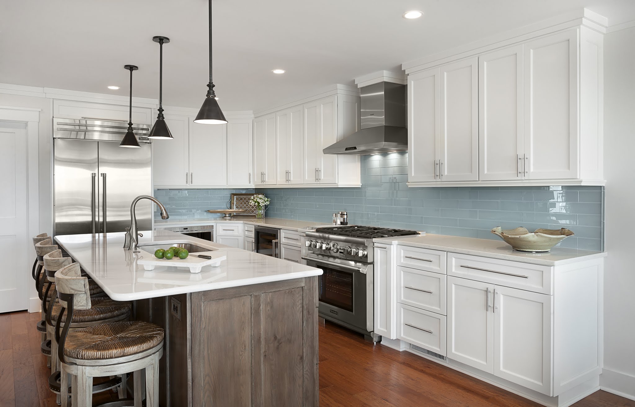
Blue and White
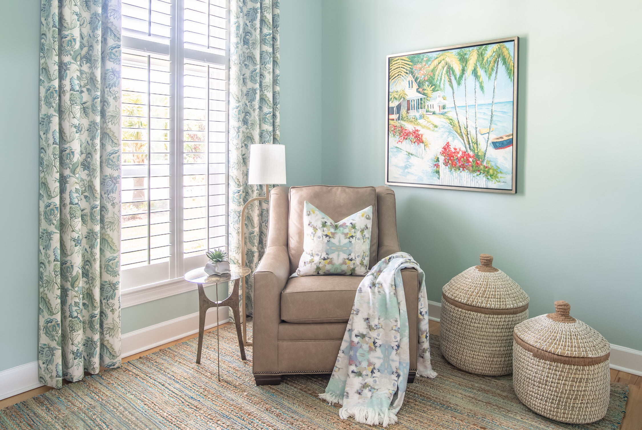
A blue and white color palette is perhaps one of the most quintessential coastal, southern color palettes. What could possibly be more classic and apropos than blue and white? When we live in an area as colorful as the South Carolina coast, blue is such a naturally occurring color that it almost goes unnoticed. A blue and white combination is also a powerful pair because a bright blue enhances the brightness of white for a crisp and refreshing feel.
If your space is feeling a little drab and you want to breathe some life back into it, a pop of blue is your solution! Come see us at CHD Interiors and let us help you make it happen!


