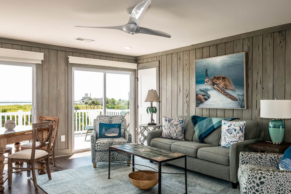
How many times have you found yourself staring at your bare windows with dread thinking, “how will I ever know what to do with all of these?” And, “How do I make sure every room relates to one another?” “Do I use the same style throughout my whole house?”
Well, we’re here to help! As Designers, we always like to push the envelope with our clients, get them to expand their horizons. Here’s an example of three window treatments styles we incorporated: ALL in one house!
The clients: Newly relocated from California, this couple is hip and fun but felt slightly overwhelmed by how to address their bare windows. They needed to have privacy from their neighbors, add some visual height, and throw some color and jazz onto the walls.
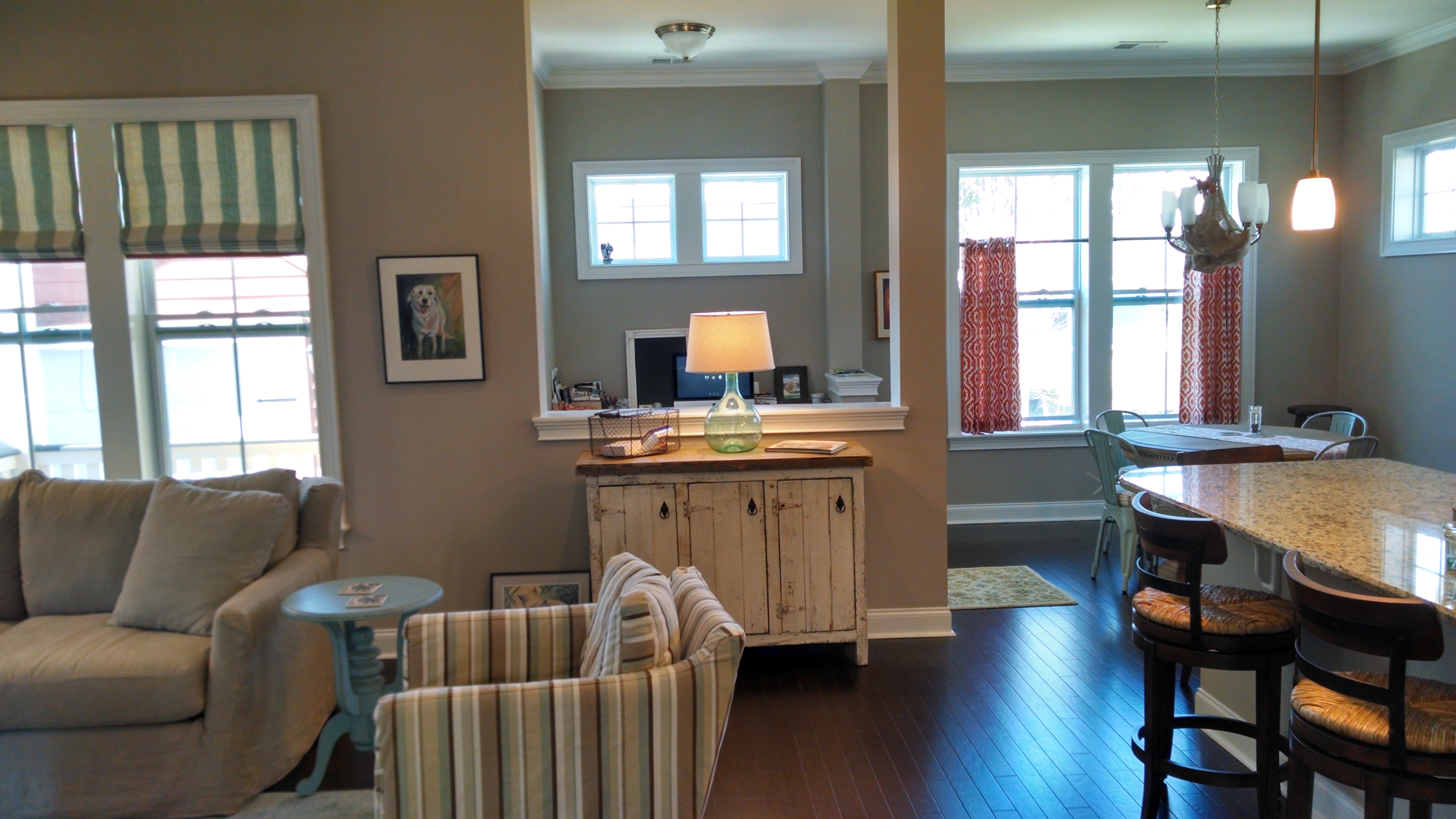
We decided on a general color palette for their main living level first: orange, turquoise and blue. After that was established, we determined what treatment style would function best in each space.
Here we go:
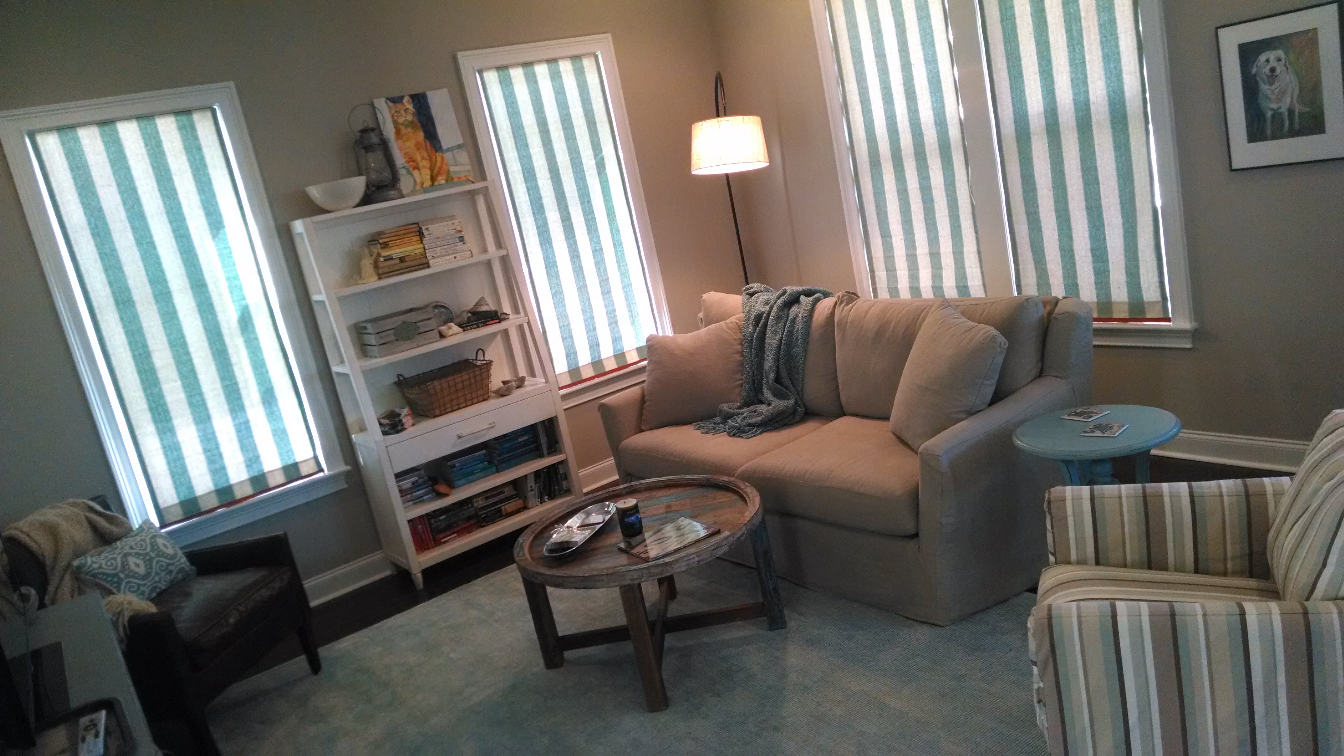
Living Room: Roman Shades!
This room needed privacy the most. The neighbor’s house was a little too close for comfort- especially at night- but we didn’t want all the fabric from drapes covering all the wall space. She wanted to hang her art up! So roman shades it was. And a nice stripe was just the ticket.

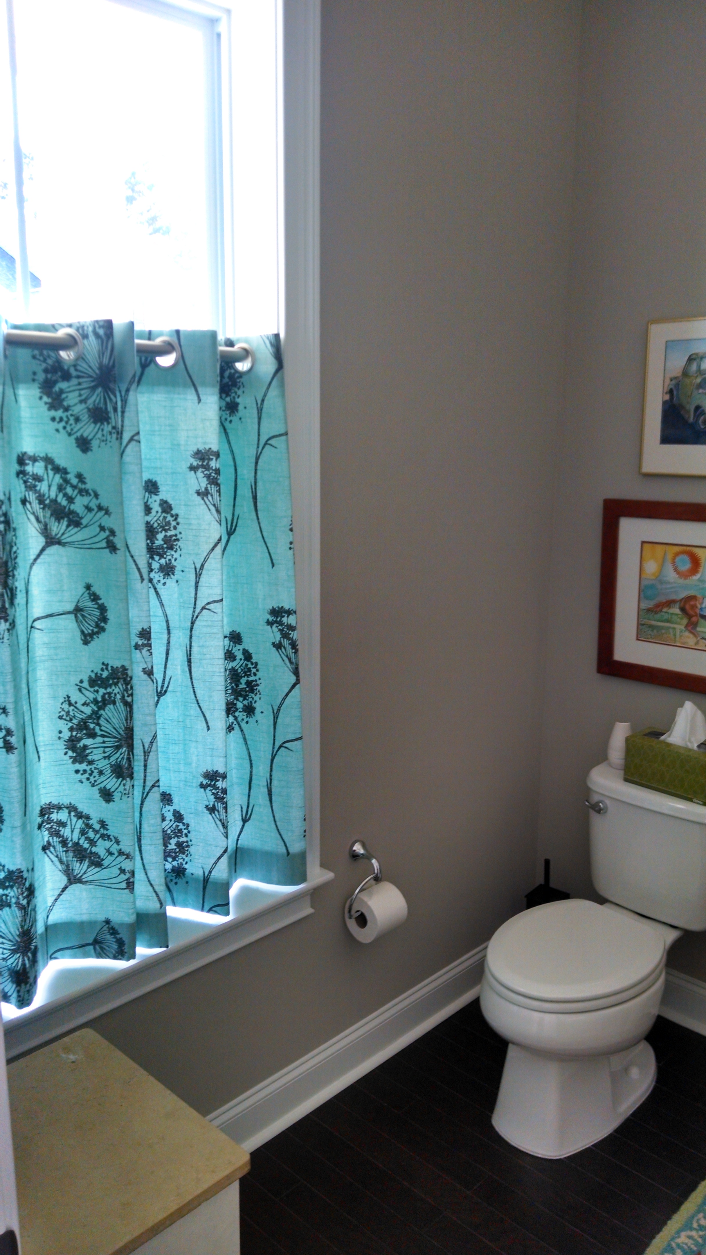
Kitchen: Cafe Curtains!
The kitchen, while connected to the living room, needed its own identity. It needed a little flavor so we decided to incorporate a fun orange pattern. To best function for the couple, we decided to create a tall cafe curtain that they could draw at night (or during the morning time with their robes on!) but still get the morning light from above.
*We also repeated this style in the powder bath and master bathroom! Such a great look.
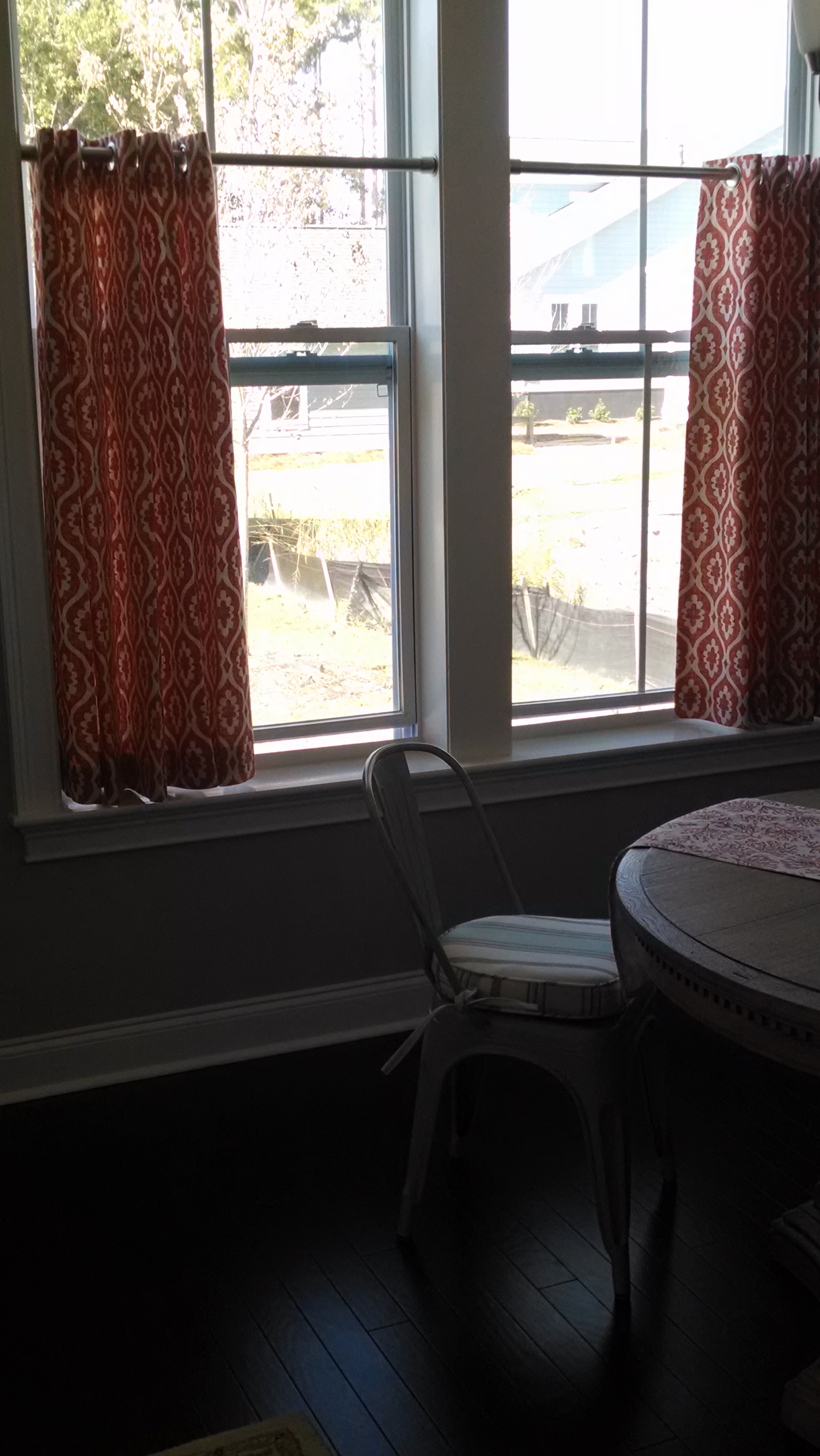
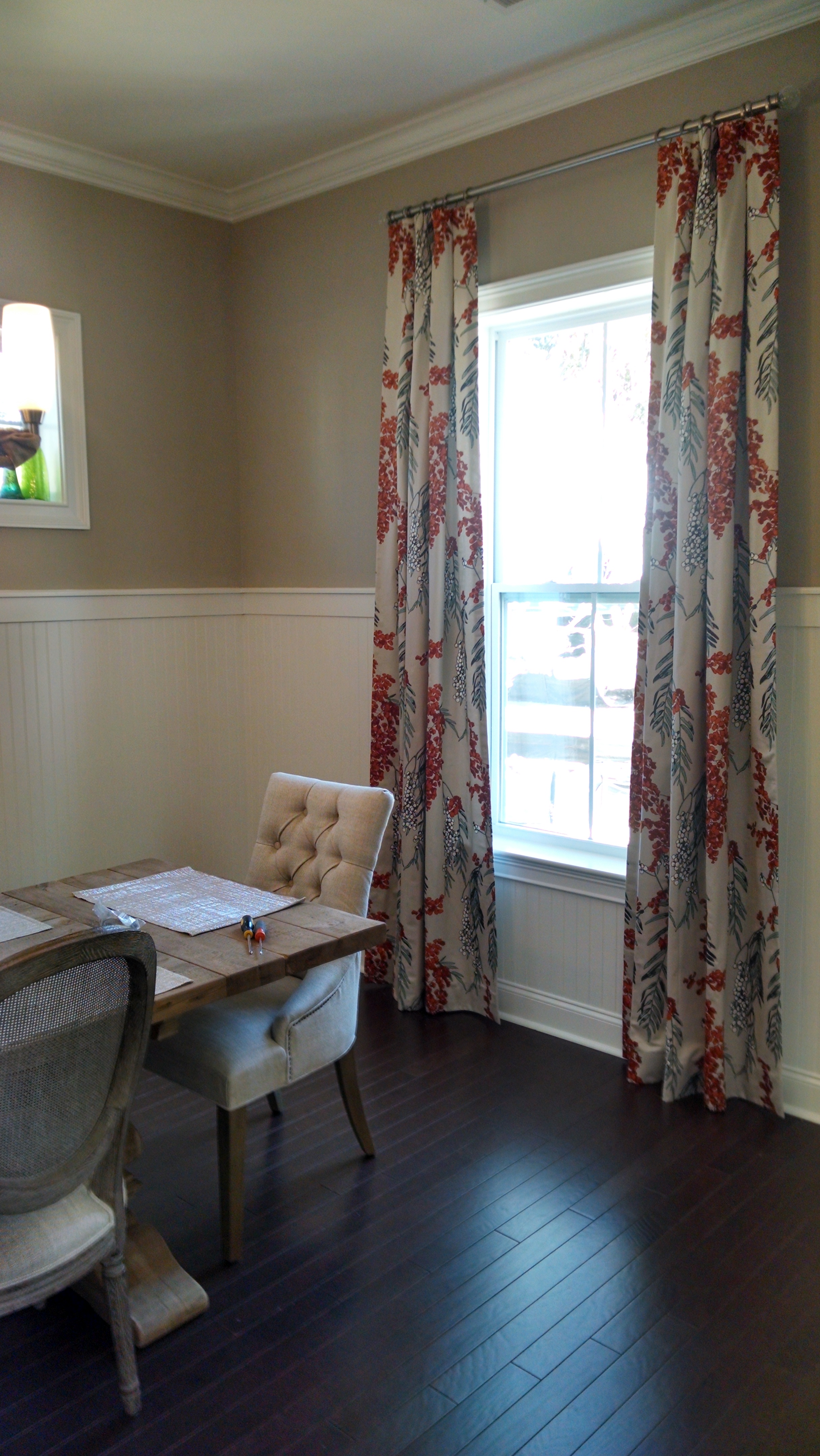
Dining Room: Drapes!
We love drapes; they’re so versatile! They can be very relaxed or more formal, but we decided to use them in a bold fabric to amp up the status of this dining room. We used a Romo fabric that pulled the orange out of the kitchen treatments, and the orange accents elsewhere in the house. The small turquoise accents tied the living room back in as well.
Our advice? Don’t be afraid to mix and match as long as you can relate them with color palette. patterns, etc. And if you aren’t sure how to do that? Call us! We’ll be glad to help.