“Mere color, unspoiled by meaning, and unallied with definite form, can speak to the soul in a thousand different ways.” Oscar Wilde
Colors quickly convey emotions and affect people’s moods. It is a cue that grabs your audience and gets them to see what you want them to see and feel what you want them to feel. Primary colors are red, blue and yellow. These are pure saturated colors from which almost all color combinations can be derived. Pure saturated colors are the most vibrant and intense colors and stir the most emotions.
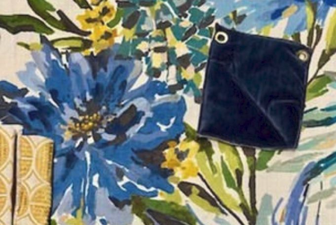
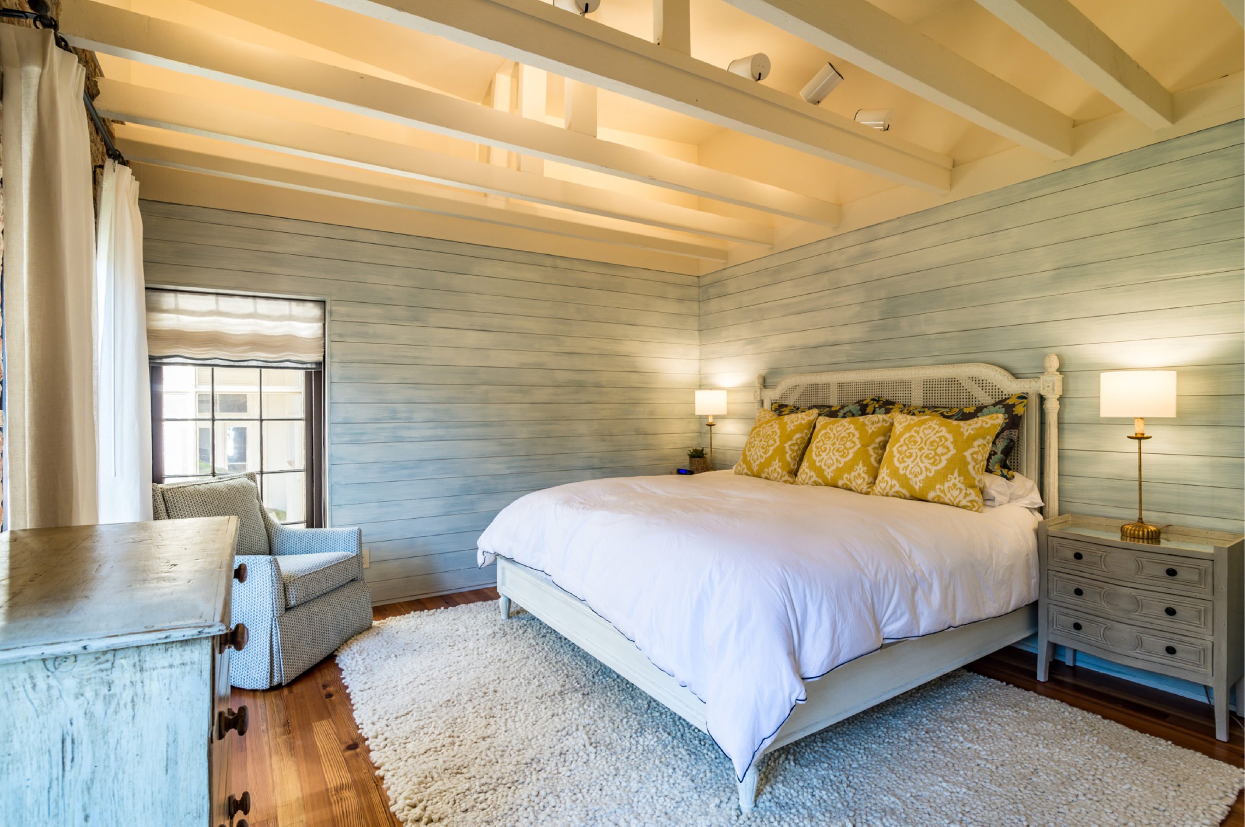
Blue, for example, is the color of both sophistication and spirituality and evokes feelings of serenity and relaxation. Many spas use blue to facilitate a feeling of tranquil relaxation. Bring this color into the master bedroom for a peaceful, restful retreat from the outside world.
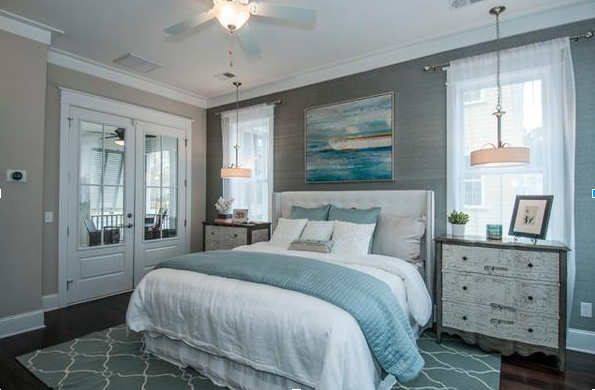
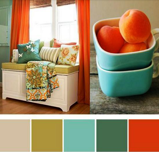
By combining blues with secondary colors such as green and orange, both having yellow as the base color, it instantly boosts the mood. This color combo brings a pop and vitality to the space. Inspired by Mediterranean style, this modern color combo defines one of the most on-trend design styles of 2016.
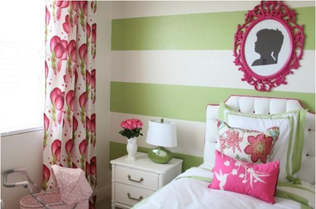
This year, greens, for spring, evoke a fresh newness, and work in harmony with vibrant pinks. This color combination creates a light and sparkling vibration for your space. Cheery and bursting with a feeling of renewal, this space is alive with color and youthful exuberance.
“Colors this season transport us to a happier, sunnier place where we feel free to express a wittier version of our real selves.”
Leatrice Eiseman Executive Director, Pantone Color Institute™